
Mobile App Knowledge
Top 4 tools to test your mobile website

While it is important for you to build a mobile website, regardless of your business, we also bring you the best practices for creating your mobile website.
While you have many tools at your disposal to create your website as you envision it, it’s imperative that you first test your website thoroughly before you send it live on mobile devices. you choose.
The main problem here is that you are dealing with too many mobile devices and mobile operating systems and therefore testing your website on each of these devices becomes very laborious and expensive. To make your job simpler, there are useful tools available to help you ensure that your website is completely mobile-friendly.
Here, Sento App Design brings you a list of top 4 tools to test your website intended to go live on mobile devices:
I. W3C Mobile Checker

W3C Mobile Tester is one of the best tools for you, to help you test the performance of your website on mobile devices. This tool performs several tests on a website before estimating how compatible your site is with the mobile web. W3C has developed a MobileOK Basic Tests 1.0 specification, which works to give you a clear idea of the mobile-friendliness of your website.
II. Iphone

A very accurate iPhone tester, this is also available to you absolutely free. Although iPhoney is not actually an emulator, it allows you to build 320x480px websites, compatible with iPhone screen specifications.
This implies that you can test both your website code and images in a realistic Apple Safari type of environment, which includes all the features of the original iPhone, such as zoom, plugins, horizontal and vertical degrees, etc
III.Google Mobilizer

Google Mobilizer is a simple and very user-friendly tool to test your website on mobile browsers. To work with this tool, you just need to enter your website address in the box provided for this purpose. Once that’s done, you can easily crop and tweak your website to make it as mobile-friendly as possible. This is one of the best tools for you, as it gives you a realistic visual input of your page on the mobile web.
IV. MobiReady
MobiReady is very similar to Gomez, only it’s a bit more complicated than it is. Also based on online testing, this tool requires you to enter your website address, on which it performs various compatibility tests like Page Test, Site Test, Markup Test , etc. At the end of the test, the tool gives you a comprehensive results page, giving you compliance with dotMobi, device emulator, code testing, HTTP testing, and error reporting details for your better understanding.
Best regards!

Our Services:

Explore Top Home Design Apps on iOS – Create Your Dream Home
Designing and building your dream home has become easier than ever thanks to the...
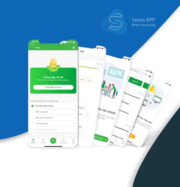
Explore Finhay App – Effective and Convenient Financial Investment Solution
In the context of economic change and financial market development, investment and personal financial...

Application Design Costs – Detailed Instructions
App design is currently the solution to all the requirements of a person in...

TOP 6 Elements Needed To Design A Food Delivery App
Food delivery app design has increased in the days following the COVID-19 epidemic. Digital...

Top 10 Popular Food Ordering Applications Today – Sento App
In the age of technological development, ordering food through applications has become an inevitable...

Discover the Top Cheapest Food Delivery Apps in Vietnam – Save Every Meal
In the age of digitalization and convenience, ordering food through food delivery applications not...
What is an App on the iOS Platform? Explore This Interesting Phone Application
Applications on the iOS platform have become an indispensable part of our daily lives....

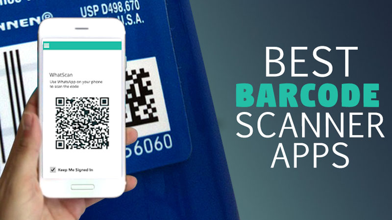
Top 5 Barcode Scanning Applications Worth Using for Work and Daily Life
In today’s digital age, barcodes have become an indispensable part of managing product and...
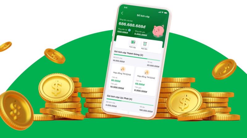
Top 5 Most Effective Savings Deposit Applications in Vietnam
In the digital age, saving money has become easier than ever through online financial...

Top 10 Food Ordering Apps in Vietnam: Perfect Choice for Quick Meals
In today’s modern society, ordering food through apps has become an indispensable part of...

Top 10 Most Effective English Learning Applications in Vietnam
Learning English is not only a skill, but also a door that opens to...

Top 10 Effective Barcode Scanning Applications for Work and Daily Life
In today’s digital age, using barcode scanning applications has become more popular than ever....

Top 5 Popular Taxi Booking Apps in Vietnam – Convenient and Safe Journey
In the digital age, traveling by taxi has become easier and more convenient than...

Top 5 Popular Bus Booking Apps in Vietnam – Safe and Convenient Journey
In the era of digitalization and 4.0 technology, traveling by bus has become easier...
How to Download and Use Product Barcode Scanning App Effectively?
In the noisy modern world, finding product information and comparing prices has become easier...
Economical Delivery App – The Best Partner For Fast and Efficient Delivery Service
In the age of digitalization, delivery services have become an indispensable part of daily...

CUSTOMER ACQUISITION & RETENTION DIAGRAM
Customer acquisition & retention diagram is what Tu has compiled from his long-term work...

10 best SEO tools
Search engine optimization, or SEO, is the act of optimizing your website for search. From...

Operating systems and computer networks
Every computer has an operating system (OS), and networking capabilities are built into all...

9 free tools to help you create a mobile website
Creating a mobile version of your website can be an extremely difficult task. However, in...
