App design
Complete collection of application design for Android APP

Android users expect your app to look and function in a platform-appropriate way. Not only should you follow material design guidelines for visual templates and navigation, but you should also follow quality guidelines for compatibility, performance, security, and more.
The following links provide everything you need to design high-quality Android mobile apps.
Use colors and palettes
The Material Design color system uses an organized approach to applying color to your User Interface. In this system, primary and secondary colors are typically chosen to represent your brand. Dark and light variations of each color can then be applied to your user interface in different ways.
Colors and themes
Your app’s primary and secondary colors, and their variations, help create a harmonious color theme, ensure text is accessible, and differentiate UI elements and surfaces from each other.
To select primary and secondary colors and create light and dark variations of each color, use the Material Design palette tool, the Theme Editor, or the Material Design 2014 palette.
A table of primary and secondary samples
- Primary color indicator
- Secondary color indicator
- Light and dark variations
Rule
Colors indicate which elements interact, how they relate to other elements, and how prominent they are. Important elements should stand out the most. Text…
Emotion
Reinforce your brand by displaying your brand colors at memorable moments that reinforce your brand style.
Create color themes
Basic material color theme
Material Design is designed with a basic theme built in, which can be used natively, straight out of the proverbial box. This includes default colors for…
Main color
The primary color is the color most frequently displayed on the screen and app elements. If you don’t have a secondary color, your primary color…
READ MORE
A primary color is the color most frequently displayed on the screen and app elements.
If you don’t have a secondary color, your primary color can also be used to highlight elements.
The main variations are dark and light
You can color theme your app using a primary color, as well as dark and light primary variations.
Distinguish UI elements
To create contrast between UI elements, such as distinguishing the top app bar from the system bar, you can use light or dark variations of the main color on each element. You can also use variations to differentiate elements within a component, different variations are used on the floating action button container and the icon within it.
Light and dark variations of the primary color differentiate the top app bar from the system bar.

Secondary color
A secondary color provides more ways to highlight and differentiate your products. Having a secondary color is optional, and should be applied sparingly as an accent…
READ MORE
A secondary color provides more ways to highlight and differentiate your products. Having a secondary color is optional and should be applied sparingly to highlight selected parts of your user interface.
Secondary colors are best for:
- Floating action button
- Selective controls, such as sliders and switches
- Highlight selected text
- Progress bar
- Links and titles
Dark and light secondary variations
Like your primary color, your secondary color can come in dark and light variations. You can create color themes using primary colors, secondary colors, and dark and light variations of each color.
Dark and light variations of primary and secondary colors

Surface, background and color errors
Surface, background and error colors are often not representative of the brand:
READ MORE
- Surface color affects the surface of components, such as cards, sheets, and menus.
- Colo r backgrounds appear behind scrolling content. The background color and surface color are #FFFFFF.
- Error colors indicate errors in elements, such as invalid text in a text field. The baseline error color is #B00020.
Font style and icon color
Elements in your app use colors from specific categories in your color palette, such as primary colors. Whenever other screen elements, such as…
Colors above
Elements in your app use colors from specific categories in your color palette, such as primary colors. Whenever other screen elements, such as text or icons, appear before surfaces that use those colors, those elements should use colors specifically designed to appear clearly. clear and distinct compared to the colors behind them.
This type of color is called color on colors, in fact color elements are sometimes placed on top of primary surfaces using a primary color, secondary color, surface color, background color or error color. They are labeled using the original category name (such as primary color) with the prefix “on”.
The On color above is mainly applied to text, icons, and strokes. Sometimes, they are applied to surfaces.
The defaults for these colors are #FFFFFF and #000000.
Colors are accessible
To ensure that color provides an accessible background behind light or dark text, you can use light and dark variations of main and…
READ MORE
To ensure that color provides an accessible background behind light or dark text, you can use light and dark variations of the primary and secondary colors.
Additionally, these colors can be used for typography that appears in front of light and dark backgrounds.
Color sample
A swatch is a sample of a color selected from a series of similar colors.
The check mark indicates whether the text color is legible in front of the background:
- A white check mark indicates when white text is easy to read against a background color
- A black check mark indicates when black text is easy to read against a background color

For apps that use white text, the background image must be accessible against white. These white check marks indicate when white text is accessible on different background color patterns. The 400 color swatch is applied to this UI.
For apps that use black text, the background image must be accessible in black. These black check marks indicate when black text is accessible on different background color patterns. Color swatch 50 is applied to this UI.
Alternative color
The Material Design color system supports alternate colors, which are colors used as replacements for your brand’s primary and secondary colors (they form complementary colors…
The Material Design color system supports alternate colors, which are colors used as replacements for your brand’s primary and secondary colors (they form complementary colors to your theme). Apps can use alternate colors to establish themes that differentiate different sections.
Alternative colors are best for:
- The app has light and dark themes
- The app has different themes in different sections
- The application exists as part of a product suite
Alternative colors should be used with caution, because they can be challenging to make cohesive with existing color themes.
Alternative colors for section themes
Alternate colors can be used to theme different parts of an application. Owl is an educational app that offers courses for people who want to…
READ MORE
Alternate colors can be used to theme different parts of an application.
Color complements data visualization
Apps can use additional colors to convey categories that are outside of your main color theme. They are still part of your full color…
READ MORE
Apps can use additional colors to convey categories that are outside of your main color theme. They are still part of your full color palette.
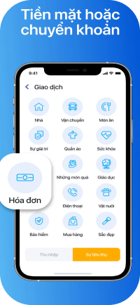
- The Account section uses green color
- The Bills section uses orange and yellow
- The Budget section uses purple and blue


